Styleboard: how to understand customers’ needs

What is a styleboard?
The board represents the graphic side of the project and is a key stage in the online branding process. It does not replace other important stages of web design, such as content creation or user experience research – all these processes work together.
The basic elements and principles of graphic design are at the heart of the styleboard.
You should study lines, colors, shapes, patterns, textures, space, unity, harmony, balance, rhythm, contrast, accents, etc. in order to understand in which visual direction the client is thinking.
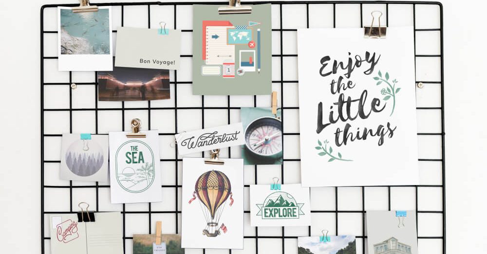
Styleboards differ from moodboards, which designers traditionally use to approve the visual appearance of a design project. Even the most effective moodboards are too abstract to show what the future interface might look like.
As a result, you not only involve the client in the process of collaboration but also get approval for your idea direction. Even if the final design does not include anything from the initial concept, the styleboard will help to talk to the client and understand whether we are moving in the right direction.
Add Your Heading Text Here
Before creating a styleboard, we should conduct a detailed study and understand the goals of the site, the target audience, the message to be conveyed, etc.
In addition to researching goals and business metrics, you also need to ask the client about what feelings and emotions he wants to evoke through the site.
Some people don’t like to discuss such topics as emotions and feelings, but that’s the whole point of branding — an emotional connection with a product or service.
We need to ask the right questions and listen carefully to the language in which the client describes the desired brand image and interaction experience.
What to do with this information? First of all, analyze the client’s responses, and then prioritize, and group the key concepts into 2 or 3 groups.
Next, focus on these topics when evaluating the first version of the design: did we manage to convey the right ideas?
Designers often don’t like when customers say, “I want the color from the first example, the symbol from the second example 2, and the font from the third example.” But this is the whole purpose of the styleboards: the client can clearly convey his thoughts and visual images.
After receiving feedback from the client, you will be able to create a hybrid styleboard that will form the basis of the future design. Since this is an important milestone in our process, it makes sense to coordinate the resulting hybrid board with the client and sign it.
It turns out that at this stage of work, the client is already actively involved in the process: we listen to him, consult with him, if necessary, involve him in finding a solution. As a result, trust appears, and the final product becomes better.
You can apply the styleboard to the structural diagrams of the pages. To save time and resources, prototypes are developed in parallel with the styleboard, because these tasks complement each other.
Also, it is easier for customers to perceive prototypes: they are usually distracted by visual aesthetics, and so they can focus on content, structure, and user experience.
The client doesn’t need surprises — at any stage of website creation. Imagine the moment when the client sees the design of the interface components for the first time. If you haven’t used a styleboard, the design will always be a surprise (good or bad).
With a styleboard, the reaction will be something like this: “Well, we have already seen the drawings and approved the styleboard, everything looks good together.”
Conclusion
So, the main advantages of the styleboard:
- – considers emotions as a UI component of design;
- – helps to determine the visual language in the early stages;
- – helps to reach a consensus with the client at the very beginning and keep it throughout the workflow;
- – involves deep client immersion in the process;
- – allows you to get official approval from the client;
- – reduces risk and removes the surprise factor;
- – works on trust;
- – allows you to simultaneously work out the visual and functional side of the project (drawing/prototype).
Search Blog
Categories
- Analytics(16)
- Android Development(1)
- Apps development(1)
- Branding(32)
- Branding solution(20)
- Business(20)
- Construction marketing(2)
- Design(12)
- Design and creative(15)
- Digital solution(14)
- Facebook(4)
- Google Ads(6)
- Graphics(9)
- Instagram(8)
- Marketing research(15)
- Marketing solution(20)
- Marketing strategy(23)
- PPC(9)
- SEO(12)
- SMM(18)
- Social media marketing(12)
- TikTok(5)
- Uncategorized(7)
- Video content(4)
- Video production(4)
- Web Design(4)
- Web Development(6)
- YouTube(3)
Categories
- Branding solution (2)
- Brand identity
- Brandbook
- Design and creative (2)
- Graphic design
- Illustration
- Marketing solution (4)
- Marketing
- Marketing research
- Marketing strategy
- Mystery shopping
- Didgital solution(4)
- Google, Facebook ADS
- Search Engine Optimisation
- Website development
- Digital marketing
- Social media marketing(5)
- Facebook marketing
- Instagram marketing
- LinkedIn marketing
- Complex SMM
- TikTok Marketing
- Video production(4)
- Short video production
- Video animation
- Video presentation
- YouTube Marketing
Our Top Articles
Recent Posts
- How CMCG Marketing Agency Helps Grow HVAC Businesses October 24, 2024
- Marketing Solutions for HVAC Companies September 13, 2024
- Working with Negativity on Social Media October 3, 2023
- The Difference Between Rebranding and Redesign October 2, 2023
- Font Marketing Development: The Power of Typography in Branding and Design September 28, 2023
Popular Tags
Advertising Analytics Artificial intelligence brand Brand book Brand identity Brand management Brand platform Brand positioning Brand recognition Brand visibility Content marketing Customer Journey Map Customer segmentation Digital advertising Digital marketing Facebook Google Ads Graphic design Influencer marketing Instagram Instagram post Landing page Logo design Marketing Marketing agency Marketing efficiency Marketing funnel Marketing strategy Native advertising Pack design PPC Reels SEO Short videos SMM Social Media Social Media Marketing SWOT analysis Target audience TikTok Tone of voice Website Website development YouTube

