Brand Color Concept
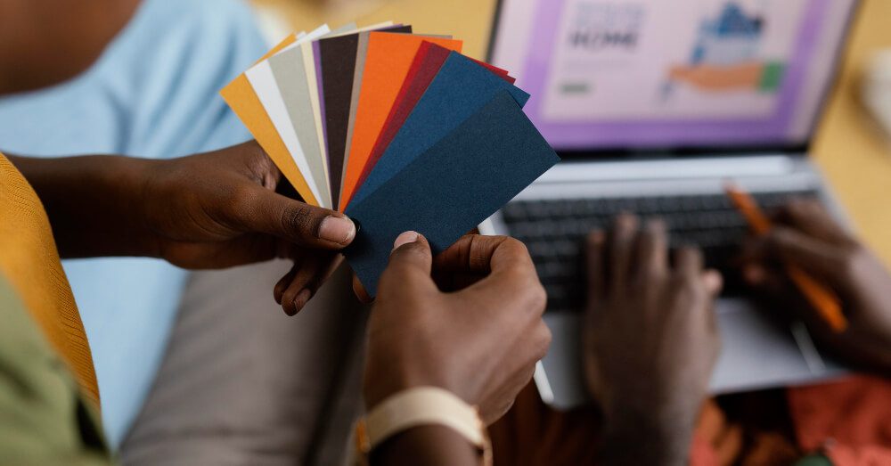
Colors in branding
The KISSmetrics analytical service conducted an interesting study, according to which 85% of consumers prefer products of certain brands, focusing on their color.
For this, we can say “thank you” to associative thinking, thanks to which a certain ready-made image is associated with each color, which was formed by culture, as well as advertising and numerous media.
For example, green means something useful and eco–friendly, while blue is the color of IT technologies. It is impossible to ignore the stereotypes that have managed to firmly enter the design and advertising offers: pink is for girls, and blue is for boys.
Each brand uses a certain palette or so-called “corporate colors” in its identity. For example, Google Corporation is a combination of four colors that have already become classics: red, yellow, green and blue.
The brand’s palette is reflected and fixed in the style guide — the guideline.
Corporate color in branding solves the following tasks:
- highlights the main thing, skillfully placing accents on the desired visual;
- promotes recognition;
- evokes emotions;
- assigns the “right” meanings to the brand.
Let’s tell you how it works, using the example of McDonald’s. Here are three logos, the first of which is used in reality.
The name in white looks neutral and restrained, but the yellow letter “M” with smooth outlines on a red background is just the embodiment of fast food: it’s like French fries dipped in ketchup.
Involuntarily, associations arise with something fast and inexpensive. It immediately becomes clear to us where we have come and what we will get.
It was worth the letter “M” to turn from yellow to lime, and the red background to turn green – and we have a completely different institution, with a clear healthy lifestyle, perhaps even something vegan.
We change the logo again and look at the third picture. The background has acquired a cold pink hue, and the letter has been repainted in burgundy.
This is no longer a fast food or healthy lifestyle establishment, but a confectionery offering buns, sweets and marmalade to visitors. See how the whole meaning of the brand changes with the help of color.
Meanwhile, there is no reliable data on how many colors you need to use when creating a company’s corporate identity (one, two or all ten) to create the right image for consumers – everything is decided individually in each case.
Color in branding. How to choose the right one
There are no strict restrictions for companies when choosing a color scheme. The recommendations mainly concern the color ratio:
- Decide on two basic shades. They should be contrasting so that the user can better view the information and read any text. This is especially true for the design of the site. In order not to overdo it with a combination of shades, we recommend using the good old classic: a combination of black text on a white background.
- Choose an accidental color. Let it be bright to encourage consumers to focus their attention on it. Usually, the most important information is highlighted in this color. An example of an accidental color is green at Leroy Merlin. In some cases, there may even be two of them – for example, IKEA places the right accents with blue and yellow.
- Use the correct encoding. This is even more important than choosing the color itself. Imagine a large company whose logo is used on a wide variety of media. Products, website, application, social networks, advertising in the media and on the street, store signs, employee uniforms and much more – on each of them, the corporate color should be displayed the same way. It must be made strictly identical for all formats. But how can the desired result be achieved?
Color encodings
It’s all about color encodings, with the help of which it is possible to transfer colors to different media. Depending on the specifics of each case , the following encoding formats are used:
- CMYK— suitable for printed products, such as booklets and leaflets.
- RGB is used in the digital sphere, including for the implementation of creative ideas in social networks.
- HEX is useful on websites and when working with applications.
- Pantone – captures the colors and their exact amount needed to get the desired shade. The encoding “tells” a specific printing house how to make calculations correctly and configure the equipment so that the color hit is as accurate as possible.
- Oracle— is used if they want to make a luminous object, for example, a signboard. To make it glow, the paint is pre-applied to a special film, and plastic carriers are already pasted over it.
The main task is to make sure that the selected color has similar shades in all the encodings you need. For example, such a large corporation as Apple has a corporate color in branding – black. It must be identical on all media.
It is absolutely impossible to imagine that on one type of product it will look deep and saturated, and on another it will look pale, similar to a warm gray color. Users will immediately begin to have questions about the authenticity of the goods:
“What if I buy a fake?”. To avoid such situations, a thorough check of the encodings is carried out.
How does the color choosing begin?
Basic steps that will help you choose and implement the right colors:
- Select the media type (physical or digital). Physical media include, for example, plastic, paper, cardboard and various signage, and digital (or digital) – websites, applications, social networks and advertising banners. It is preferable to use a different color scheme for each type (CMYK, RGB, HEX or Pantone).
- Calculate the need for the number of carriers. This is especially true for printed products. It turns out that some colors are much more expensive than others. Accordingly, the price of the product can significantly increase.
- Identify the target audience. It’s no secret that for each audience you need to choose the right colors, based on the psychological characteristics and preferences of people.
- Think over the associations and emotions that your products should evoke, because color will also help you in this matter.
- Try to take into account the seasonality. The rule is not relevant for all goods and services, but if you are branding a resort area, then it is worth remembering. Winter is associated with skiing, snowboarding and various activities aimed at young people. All shades of blue, up to acidic, are ideal – why not? And in summer, the resort turns into a quiet place of rest for couples and parents with children. For them, walking to the waterfall and “conquering” the mountains on lifts are relevant. Shades should be saturated, for example pink or green.
- Start from competitors, but do not forget about your own products. A lot depends on the scale of your business here. If you plan to occupy a large market niche, then try to become noticeable. When it comes to a small coffee shop in a residential area, it is hardly worth spending time on the selection of a corporate shade that competitors have not yet managed to occupy. It is better to take a close look at what you offer, especially the specifics of the brand, and choose a color that will represent your products as fully and objectively as possible.
- Use color harmonies. They will help you choose a branded palette. The point is that we perceive combinations that are close to natural as harmonious. To detect them, look at the color circle.
Some useful tips:
- When using several types of media, you will have to check the hue in all encodings – it must match.
- Start working on brand awareness as early as possible. Corporate colors that will form strong associations with your company will help you in this. In the end, the consumer will be able to accurately identify you among other brands.
Conclusion
The right color in branding is luck. The audience quickly gets used to it and “reads” the brand in literally seconds, once you see a familiar shade.
But it happens that a company at some point in its development understands that it is ready for changes, including the change of corporate colors.
It is necessary to approach this issue very carefully so as not to irritate and disappoint the audience in the brand or, even worse, disappear from its radar.
Search Blog
Categories
- Analytics(16)
- Android Development(1)
- Apps development(1)
- Branding(32)
- Branding solution(20)
- Business(20)
- Construction marketing(2)
- Design(12)
- Design and creative(15)
- Digital solution(14)
- Facebook(4)
- Google Ads(6)
- Graphics(9)
- Instagram(8)
- Marketing research(15)
- Marketing solution(20)
- Marketing strategy(23)
- PPC(9)
- SEO(12)
- SMM(18)
- Social media marketing(12)
- TikTok(5)
- Uncategorized(7)
- Video content(4)
- Video production(4)
- Web Design(4)
- Web Development(6)
- YouTube(3)
Categories
- Branding solution (2)
- Brand identity
- Brandbook
- Design and creative (2)
- Graphic design
- Illustration
- Marketing solution (4)
- Marketing
- Marketing research
- Marketing strategy
- Mystery shopping
- Didgital solution(4)
- Google, Facebook ADS
- Search Engine Optimisation
- Website development
- Digital marketing
- Social media marketing(5)
- Facebook marketing
- Instagram marketing
- LinkedIn marketing
- Complex SMM
- TikTok Marketing
- Video production(4)
- Short video production
- Video animation
- Video presentation
- YouTube Marketing
Our Top Articles
Recent Posts
- How CMCG Marketing Agency Helps Grow HVAC Businesses October 24, 2024
- Marketing Solutions for HVAC Companies September 13, 2024
- Working with Negativity on Social Media October 3, 2023
- The Difference Between Rebranding and Redesign October 2, 2023
- Font Marketing Development: The Power of Typography in Branding and Design September 28, 2023
Popular Tags
Advertising Analytics Artificial intelligence brand Brand book Brand identity Brand management Brand platform Brand positioning Brand recognition Brand visibility Content marketing Customer Journey Map Customer segmentation Digital advertising Digital marketing Facebook Google Ads Graphic design Influencer marketing Instagram Instagram post Landing page Logo design Marketing Marketing agency Marketing efficiency Marketing funnel Marketing strategy Native advertising Pack design PPC Reels SEO Short videos SMM Social Media Social Media Marketing SWOT analysis Target audience TikTok Tone of voice Website Website development YouTube