Complex rebranding of the manicure school.
Client
Two-magpies LLC – modern school of professional manicure.
Goal
To create a new branding for a manicure school that would position it as a premium educational service in the market and help the school stand out from its competitors and attract more students.
Solution
To achieve this goal, CMCG came up with a comprehensive branding solution that included the following:
- We developed a unique and memorable name for the school that would be easy to remember and reflect the premium quality of the education offered – two magpies.
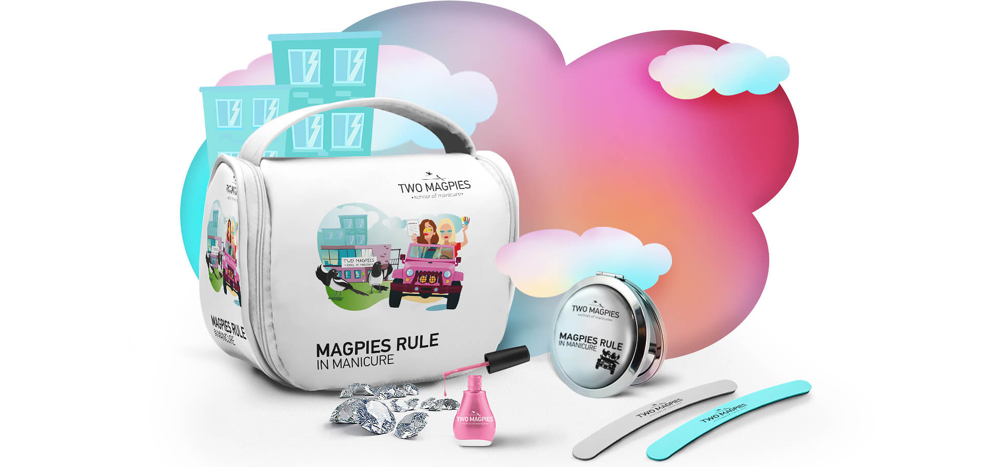
- We designed a range of packaging and product line designs that would appeal to the target audience and communicate the quality of the education offered by the school. The designs were modern, sleek, and sophisticated, with a focus on simplicity and elegance.
- We developed a corporate logo that would be instantly recognizable and reflect the premium quality of the education offered by the school. The logo was designed to be simple, elegant, and timeless, with a focus on the naming reflection and pink and purple colors.
Result
The logo and corporate identity were implemented in various aspects of the brand strategy for the manicure school.
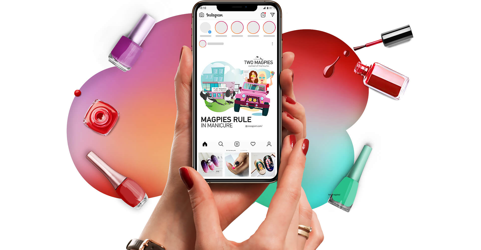
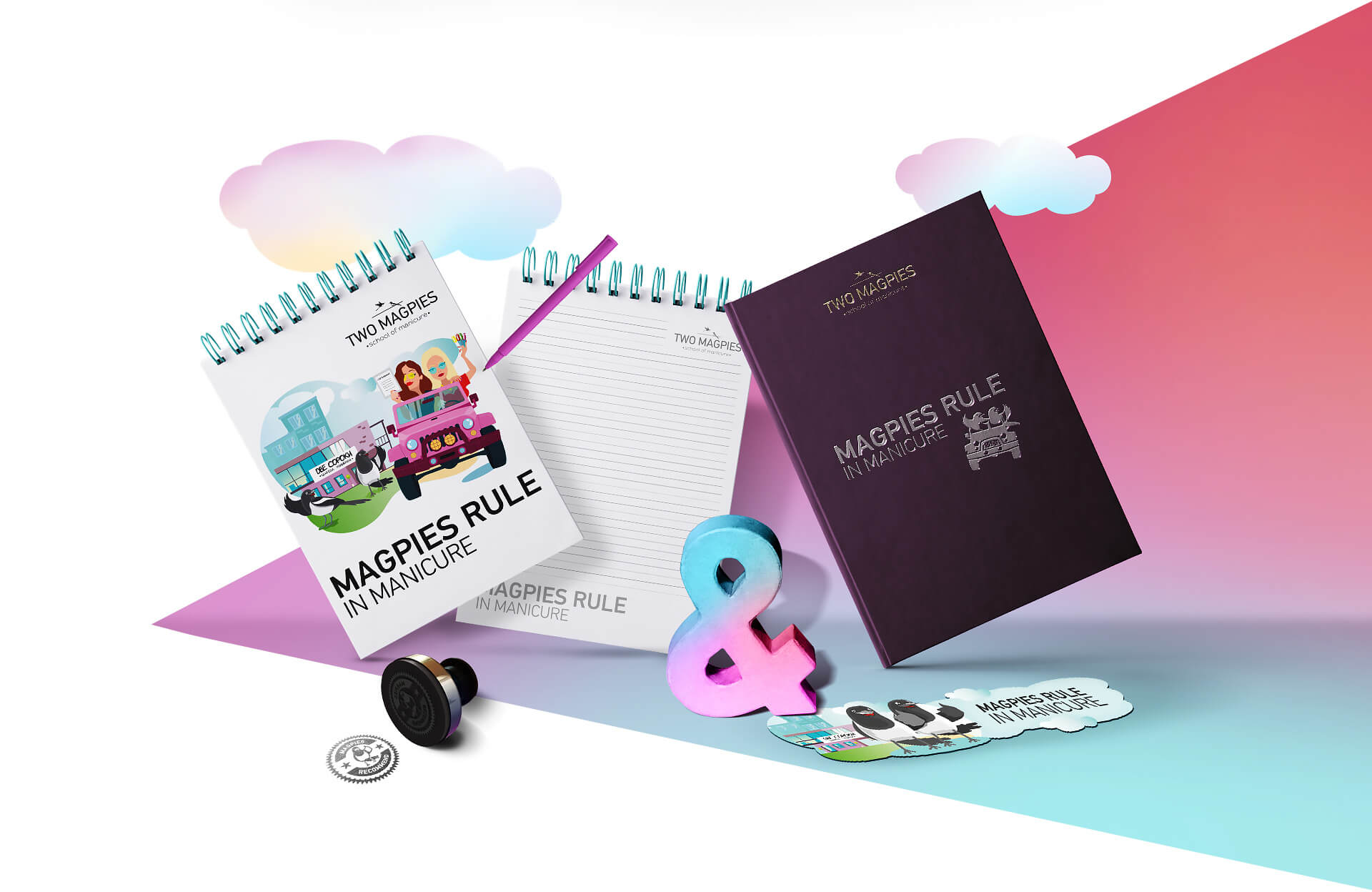
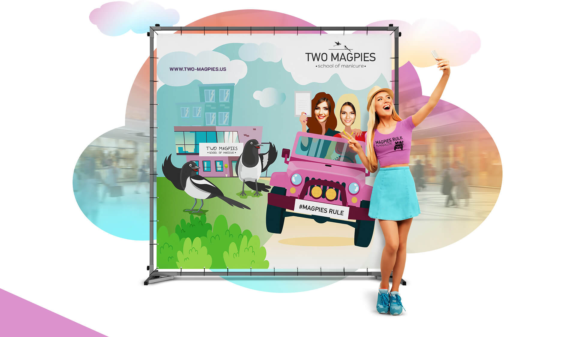
The logo was prominently displayed on all marketing materials, including flyers, brochures, and social media posts. It was also used on the school’s website and signage.
The corporate identity was reflected in the packaging and product line designs, which featured a consistent color palette of pink, blue and purple shades and typography that matched the logo.
Overall, the logo and corporate identity played a crucial role in establishing the school as a premium brand in the market and helped to attract more students. It was well-received by the target audience, and the school saw an increase in engagement and revenue.
The project was a great success, and we are proud we have helped this manicure school establish itself as a premium brand in the market.
DATE
2021Client
Two-magpies LLC


Related Project


