Tyson Foods
Client
The food company has developed a cashew-based drink for vegans and anyone who appreciates natural, healthy, and quality products. This drink is presented in seven different flavors.
Goal
Due to the development of a new product, the company turned to CMCG to develop an umbrella brand for their product line. Also, it was necessary to develop a logo and packaging for all 7 flavors of the drink.
Solution
This brand must meet international standards as the company enters the global market. So we analyzed the information and developed the CasheWell brand. CashWell is a cashew-based drink for vegans and anyone who appreciates a healthy lifestyle.
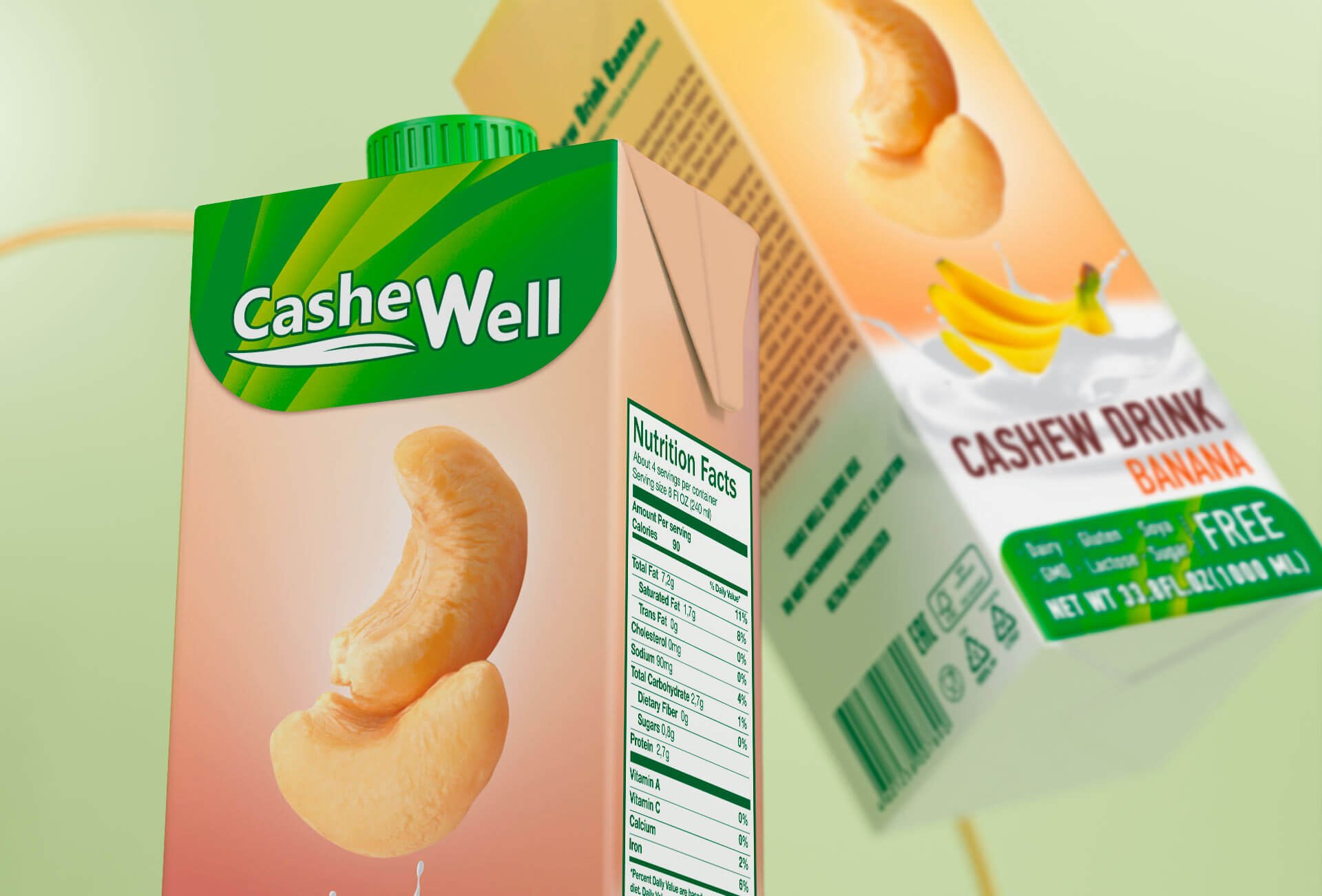
The brand name is a combination of the words “cashew”—cashew and “wellness”—recovery. We created the brand logo to be concise and simple, emphasizing the vegetable origin of the product. The simple, rounded typeface and bright white color are easy to read from a distance and leave the designer with plenty of room to use different colors in subsequent packaging. which is very important if the product line is broad. We suggested using a logo on a rounded plate for the packaging design, reminiscent of the pattern of a cashew nut leaf.
The main message of the brand is: a healthy alternative to regular milk. On the one hand, we necessarily emphasized the proximity to milk, and on the other hand, we demonstrated the unique properties of the new product.
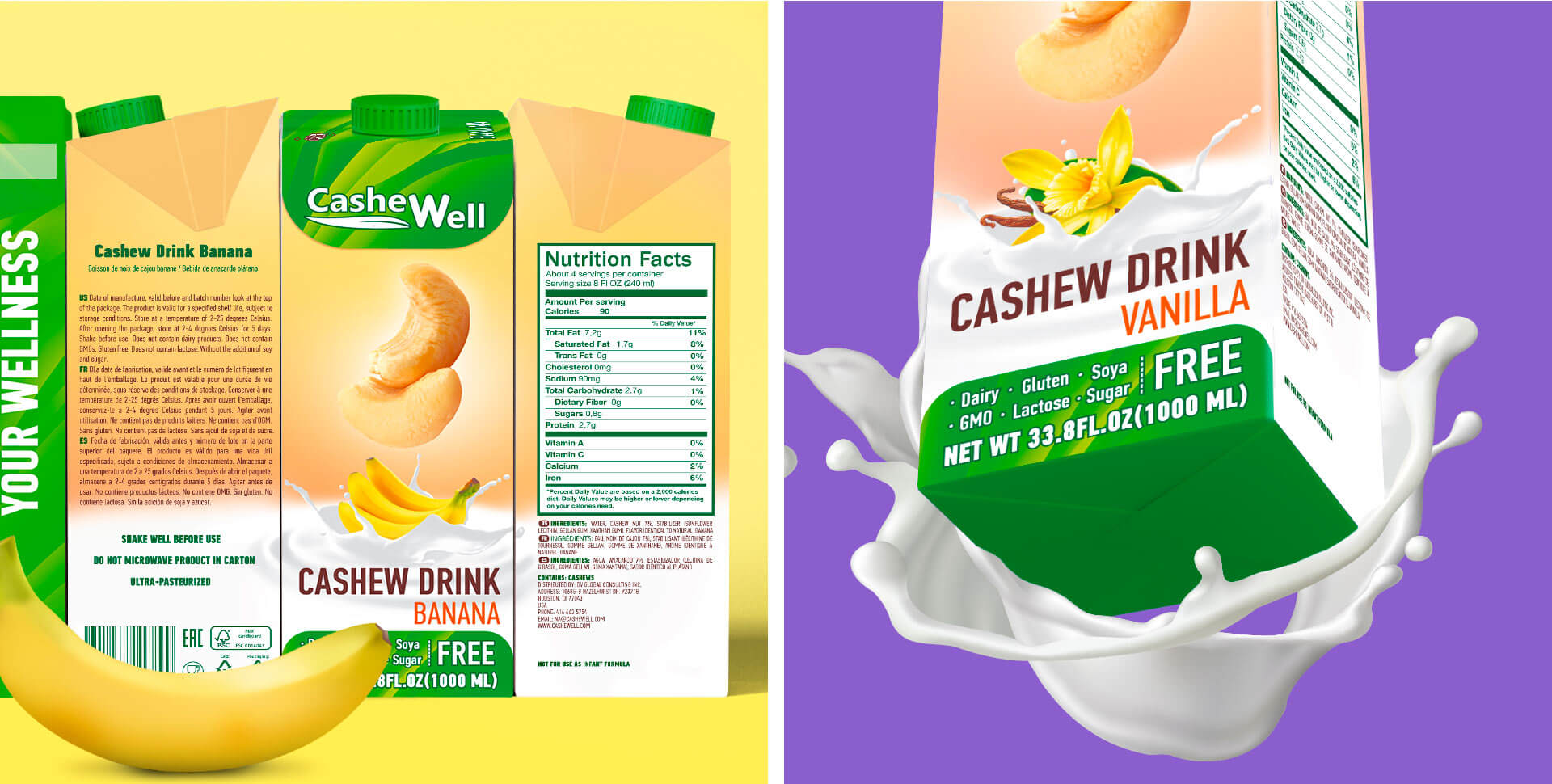
The shape of the drink packaging comes from milk. We also added milk motifs to the design in the form of characteristic splashes of milk at the bottom of the front side of the box.
Designers put a picture of cashew nuts, which are the main ingredient in the product, in the middle of the package and drew attention to it against a gradient background of different pastel colors that changed depending on the flavor of the drink.
The product line consists of 7 flavors (original nutty, vanilla, chocolate, strawberry, etc.). In the upper part of the box, in a die, there is a corresponding contrasting inscription with a flavoring variety of the product. The same information is duplicated in the illustration of milky waves.
The important advantages of the product are the absence of lactose, gluten, soy additives, and sugar. This information is placed at the bottom of the box in a block with contrasting text.
This brand turned out to be universal, attractive, and ready to enter the international market. If the product line increases, then adaptation to new products will be easy.
DATE
2021Client
Tyson Foods


Related Project


